The Diginate Guide to Infographics
Posted: in Design, Ideas, Miscellaneous
InfoWHATics?
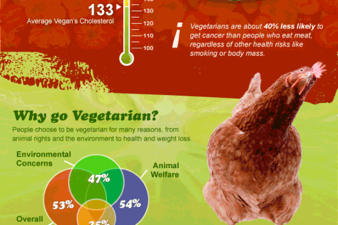
Infographics are the perfect marriage of form and function – not only do they look brilliant (if you get it right), but they’re a fantastic way to impart knowledge or tell a story. And they’re everywhere right now. You can follow the rise and fall of the Wu-Tang Clan, understand why cats are better than gold, and even find out whether or not to trust a man with a beard. The possibilities are endless.
More and more companies are using infographics as marketing opportunities; demonstrating an understanding of their particular industry in a medium easily shared via social networks.
Convinced? Of course you are. Here’s six ways to get the most from your infographic:
Use bullets, not bars
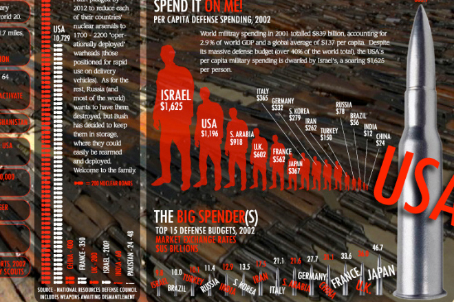
Why having boring old bars on your chart when you can have bullets? The creators of this global arms trade graphic certainly agreed. Of course, go easy on the bullets for your soft furnishing or divorce rate infographics; try and find something topical for your chart.
Easy on the text, easy on the eye
Remember, this is a graphic, not a novel. It’s not even a graphic novel. Just a graphic. Paragraphs of text will make your infographic look cluttered, and lose the attention of your viewer. A great infographic conveys meaning even without text.
visual.ly is to infographics what the B&Q carpark is to boy racers
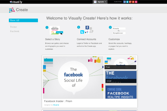
You could probably make that into a graphic in itself. Visual.ly take infographics seriously – you can browse more that 15,000 examples, upload graphics, and even create your own online. Plug visual.ly into your facebook account and it will create a chart showing how much more popular you are than your friends. Post it to your wall, sit back and watch the numbers diminish.
Think about your font before it thinks about you
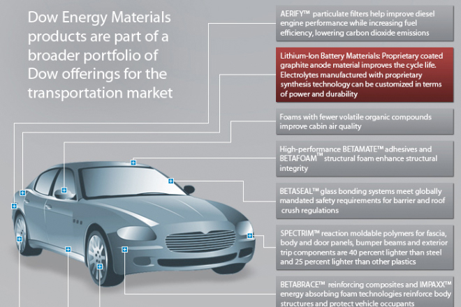
That doesn’t make any sense, but choosing the right font does. Infographics are best when they’re bold and imaginative. This example uses a grey palate and the Myriad font (the default Illustrator/Photoshop font. Coincidence?) – the result far from grabs you:
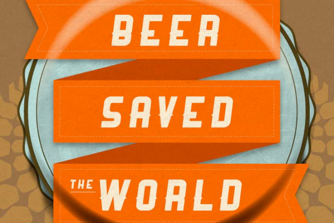
This example about beer, however, gets it right not only in terms of fonts, but also layout, colour palate, texture and, most importantly, subject matter:
Pictures make perfect
You wouldn’t leave your walls blank (you might), so why do it with your infographic? Simple illustrations and line drawings work well, but photos can also look great. Make sure you close crop them though; we don’t want it looking like a powerpoint slide of your holiday. Here’s an example of a nice use of photographic imagery:
Take it offline
What’s the point in slaving over your infographic for weeks, only for it to be viewed on titchy macbook screens the world over. Print it big, print it proud, and put it up for everyone to enjoy. Diginate posters are great for infographics as there’s no set sizes, so whether your graphic is tall and thin, or fat and stubby, we can print it at any size you like. Check out our poster options here.
