Here’s why you should be using Comic Sans
Posted: in Design, Miscellaneous
Long ridiculed in the design community, Comic Sans has reached almost anti-hero status. Alongside the campaigns to ban Comic Sans, there are now Comic Sans defenders waging battle on behalf of the infamous typeface. Here’s why you should be using Comic Sans, and 4 other things you didn’t know about your favourite fonts…
1. If you want people to remember what you’re saying use Comic Sans
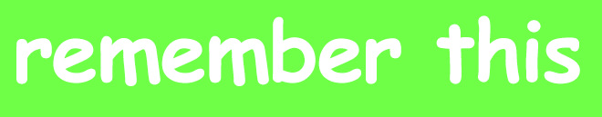
As tempting as it is to draft your document or notice in a stylish typeface such as Gotham or Gill Sans, if you want people to retain what you’re saying you should really use Comic Sans. Psychologists at Princeton and Indiana Universities presented test subjects with information sheets – half were in Comic Sans or Bodoni, and half were in Arial. On testing the participants who studied in Comic Sans or Bodoni answered 86.5% of the questions correctly, whilst the Arial participants only managed 72.8% correct answers.
The theory is that a harder to read font such as Comic Sans forces increased concentration in the reader, unlike easy to read fonts like Arial which give a false impression of comprehension.
2. If you want to save the planet use Garamond
When The New York Times removed the full stop from it’s nameplate in 1967 it claimed it would save tons of ink every year. Dispensing with punctuation is clearly not something we should all do to save ink though – you’re better off choosing an eco-friendly font. There’s a few specifically designed eco-fonts on the market, although judging by the Ryman Eco download counter they largely haven’t caught the public imagination. Ecofont is a software package that will put little holes in your normal text to save ink (they have a whole eco typeface as well), but for the casual user you’re best off selecting Garamond or Century Gothic from your existing font set. Unless you want people to understand what you’re saying of course, in which case use Comic Sans.
3. If you want to prove how wealthy you are use TEFF Lexicon
You’ve got the yacht, the Hyde Park penthouse and the white Bentley. But how will you demonstrate your wealth to hardcore font enthusiasts? Use TEFF Lexicon of course, which comes in at a cool $4996 for the whole family. Use it for your stag party invites, tumblr feed, cease and desist notices, everything – people will know how successful you are and treat you with the respect you deserve.
4. If you want to be believed use Baskerville

If you’re protesting your innocence, launching a pyramid scheme or deploying an April Fool’s prank it’s critical to choose the correct font in order to be taken seriously. That font, it turns out is Baskerville. In December the New York Times presented an article relating to a scientific discovery in a range of typefaces, and followed up with a quiz designed to test whether readers believed the contents. Subjects who read the original article in Baskerville were 1.5% more likely to be on board with the findings in the article. The reason? Cornell Psychologist David Dunning, who worked on the experiment, put it down to Baskerville’s “starchiness”.
5. If you want to improve readability for people with dyslexia use Dyslexie (or Arial)
The Dyslexie font was launched in 2008, designed to assist dyslexia sufferers with their reading comprehension. The theory was that standard typefaces are deliberately uniform, but the resulting similarity between the letters causes confusion for dyslexia sufferers. The characters in Dyslexie are all unique, aiding recognition and thereby improving comprehension. The font was much lauded on it’s release, but subsequent studies have claimed it’s actually no improvement over Arial. The moral of the story? Use Comic Sans.


