Designers – vent your frustration with Design Cliche Bingo!
Posted: in Design, Ideas, Miscellaneous, Projects
If you’re a professional designer you’ll know the toughest part of your job is dealing with difficult clients. Clients who find it challenging to articulate their requirements, or quite simply think they can do the job better than you. Of course, being a designer has loads of perks, like riding around on a cool bike that’s difficult to pedal up hills, drinking very small but inexplicably expensive tins of beer, and listening to the Velvet Underground all day. So it’s not all bad. But seriously.
Since we work with designers all the time at Diginate (and even have some in the office – that’s when they’re not rollerblading to Wholefoods) it’s in our interests that they remain as chilled out as possible. So with this in mind we invented DESIGN CLICHE BINGO.
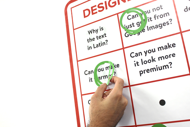
It works very much like standard bingo, but instead of boring boring numbers in each box there’s the sort of design cliche you probably receive in your iMac inbox or down the earpiece of your iPhone 6 Plus several times daily. Stuff like…
“Can you make the logo more… logo’y?”
“Our target demographic? Everyone.”
and the classic…
“Why is the text in latin?”
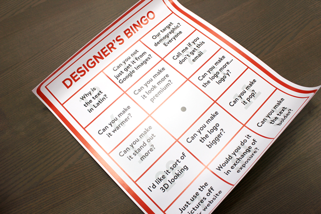
To play Design Cliche Bingo simply print the chart as a large Diginate wall sticker, and adhere to your office wall. Design Cliche Bingo works best in areas where clients are not entertained. Also order some wall sticker dabber circles, like these:
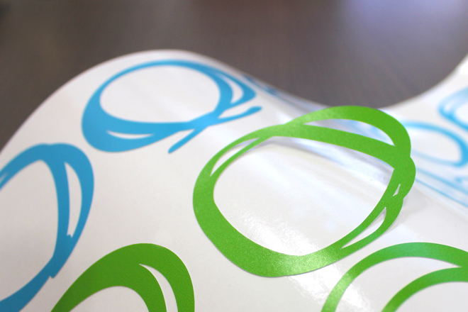
Next, select an equally irritable designer to play against (that girl with the fringe and the Hot Chip t-shirt looks ideal). Give her all the green dabber circles and you keep the blue dabber circles. Try not to mention Helvetica.
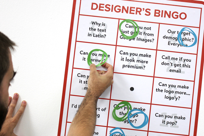
Now, whenever you receive a design cliche in your email simply mark it off the chart. The winner gets a Negroni at 4pm. Frustration averted!
