10 Sophisticated Fonts for Your 2025 Designs
Posted: in Design
In the whirlwind of chaos that is 2025, here are 10 fonts that will keep your designs looking smart, polished, and effortlessly classy.
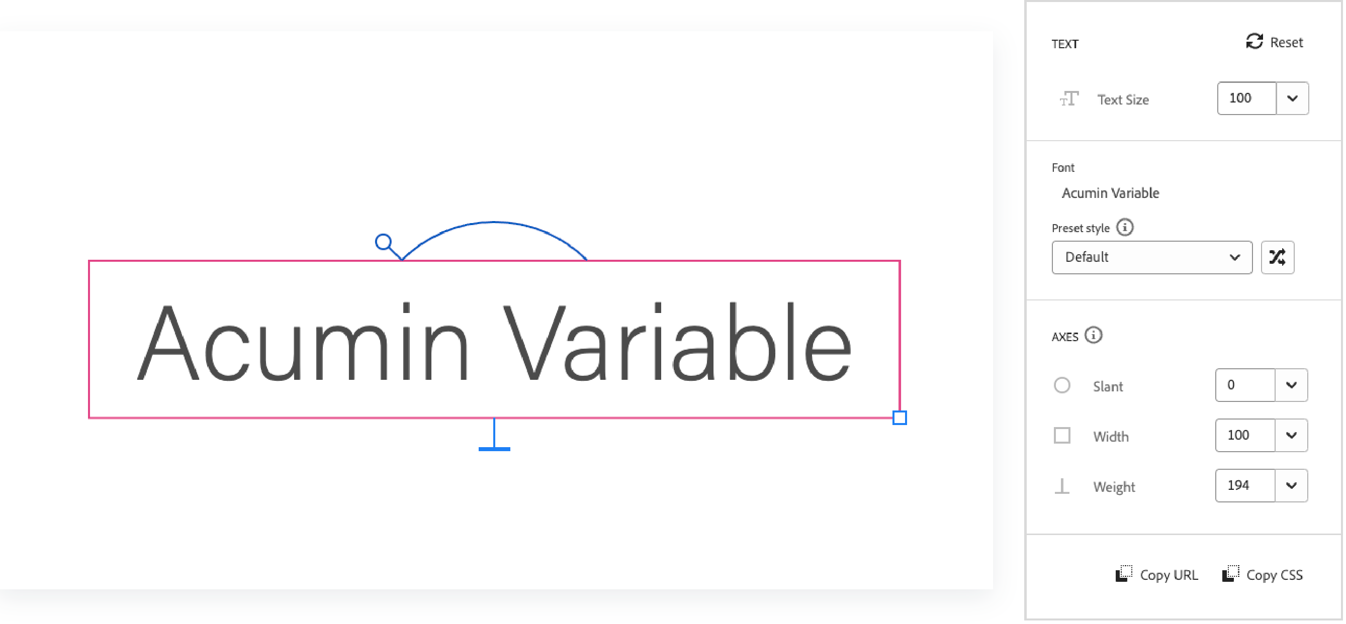
Acumin Variable Concept
Acumin Variable Concept offers a modern, versatile approach to typography. Its dynamic range—allowing adjustments in weight, width, and optical size—makes it an excellent choice for projects that demand both precision and flexibility. The design’s clean lines and refined simplicity ensure that your work always looks polished and professional.
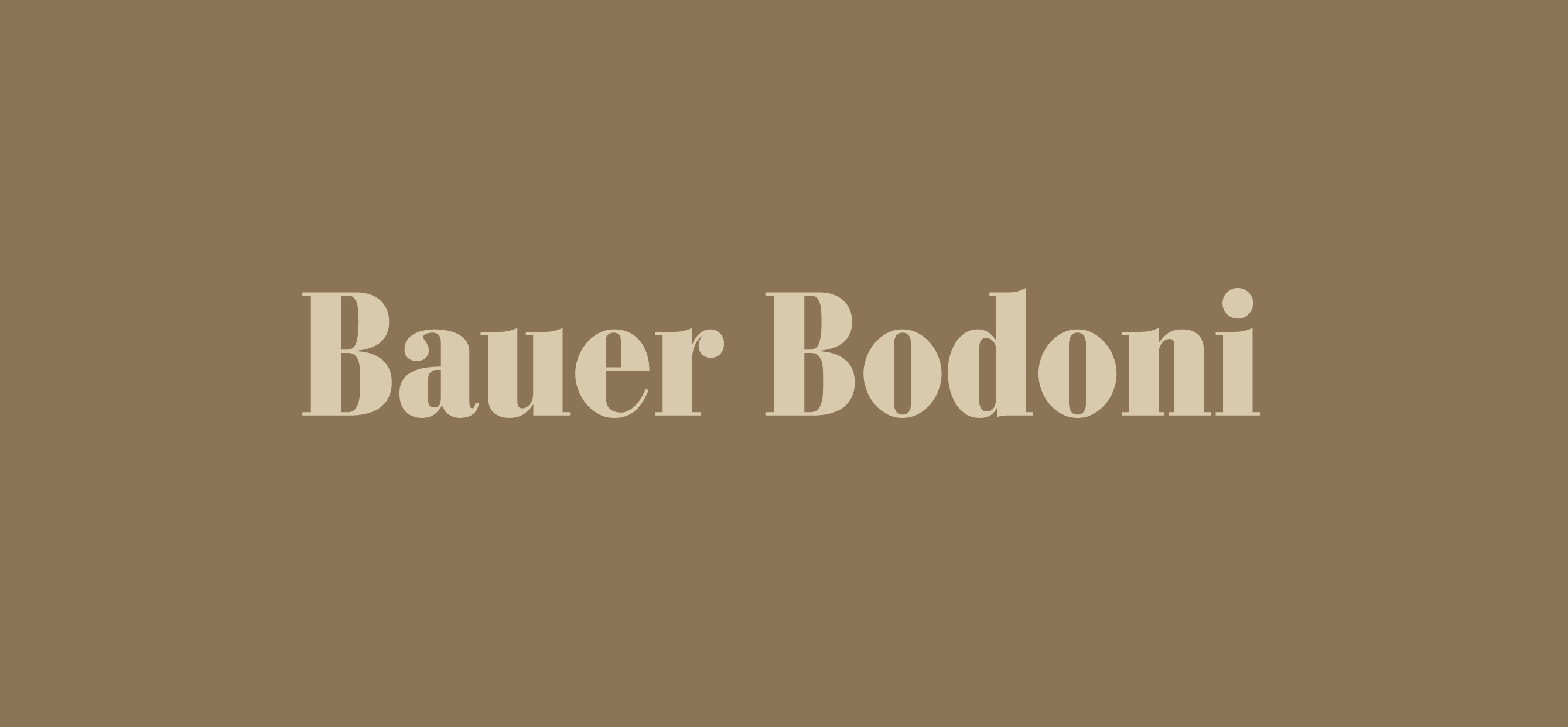
Bauer Bodoni
Bauer Bodoni reinterprets the classic Bodoni style with a contemporary twist. Its well-defined contrast and graceful curves add an element of timeless sophistication to any design. Whether you’re creating high-end editorial layouts or distinctive branding, Bauer Bodoni delivers a mature, elegant presence.
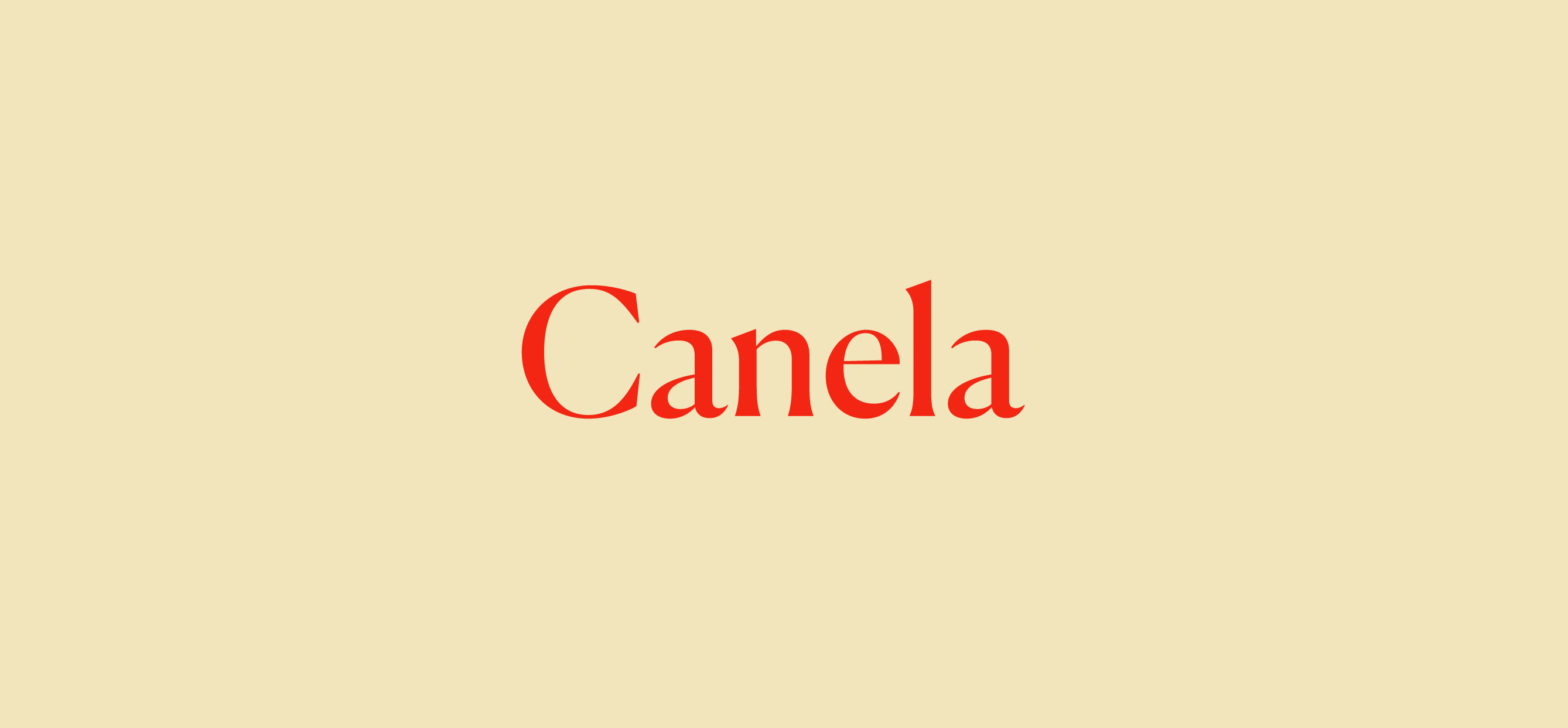
Canela
Canela is a warm, inviting serif that strikes a perfect balance between tradition and modernity. Its gentle curves and subtle detailing make it ideal for projects where a touch of personality and refinement is needed. Canela’s versatility shines through in both text and display applications, offering a consistently classy look.
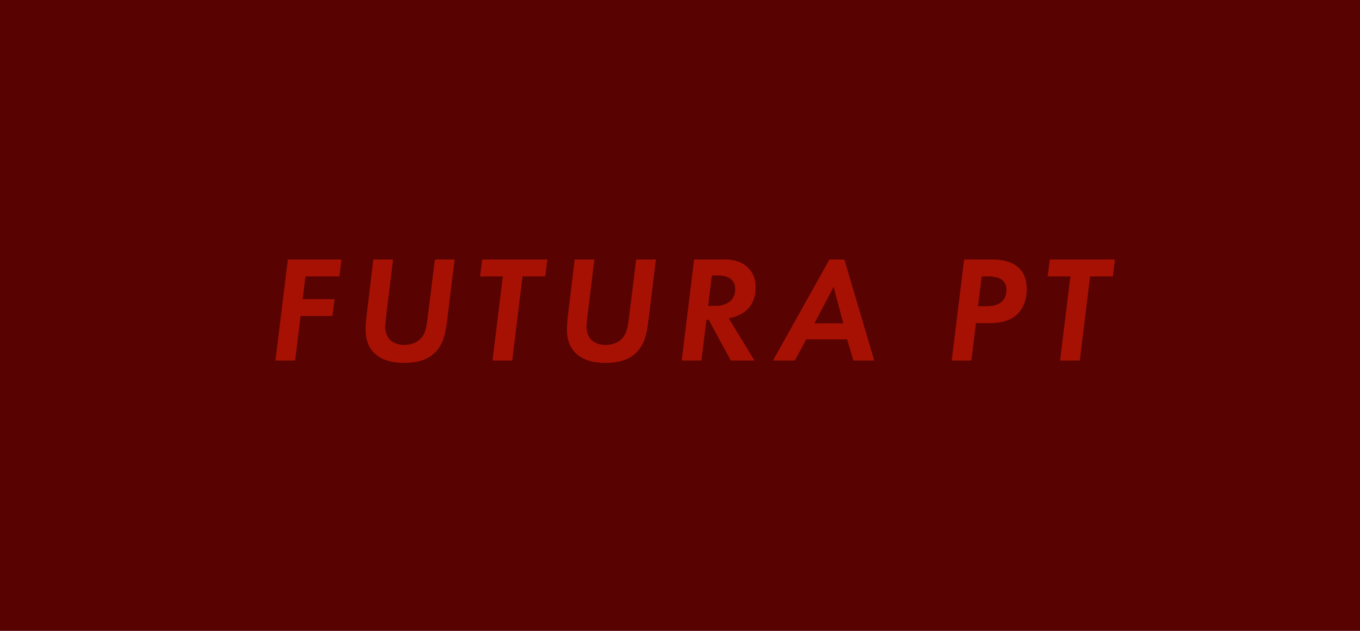
Futura PT
Futura PT is a geometric classic that continues to influence modern design. Its clean, minimalist forms and precise structure exude a sense of order and clarity. Futura PT’s balanced proportions and thoughtful spacing ensure that it remains a dependable choice for designs that require a sophisticated and timeless aesthetic.

Apercu Pro
Apercu Pro bridges the gap between humanist warmth and modern clarity. With its robust yet refined letterforms, this sans serif offers a fresh alternative to conventional corporate typefaces. Its clean design and adaptable style make it a reliable option for projects aiming for understated elegance and professionalism.
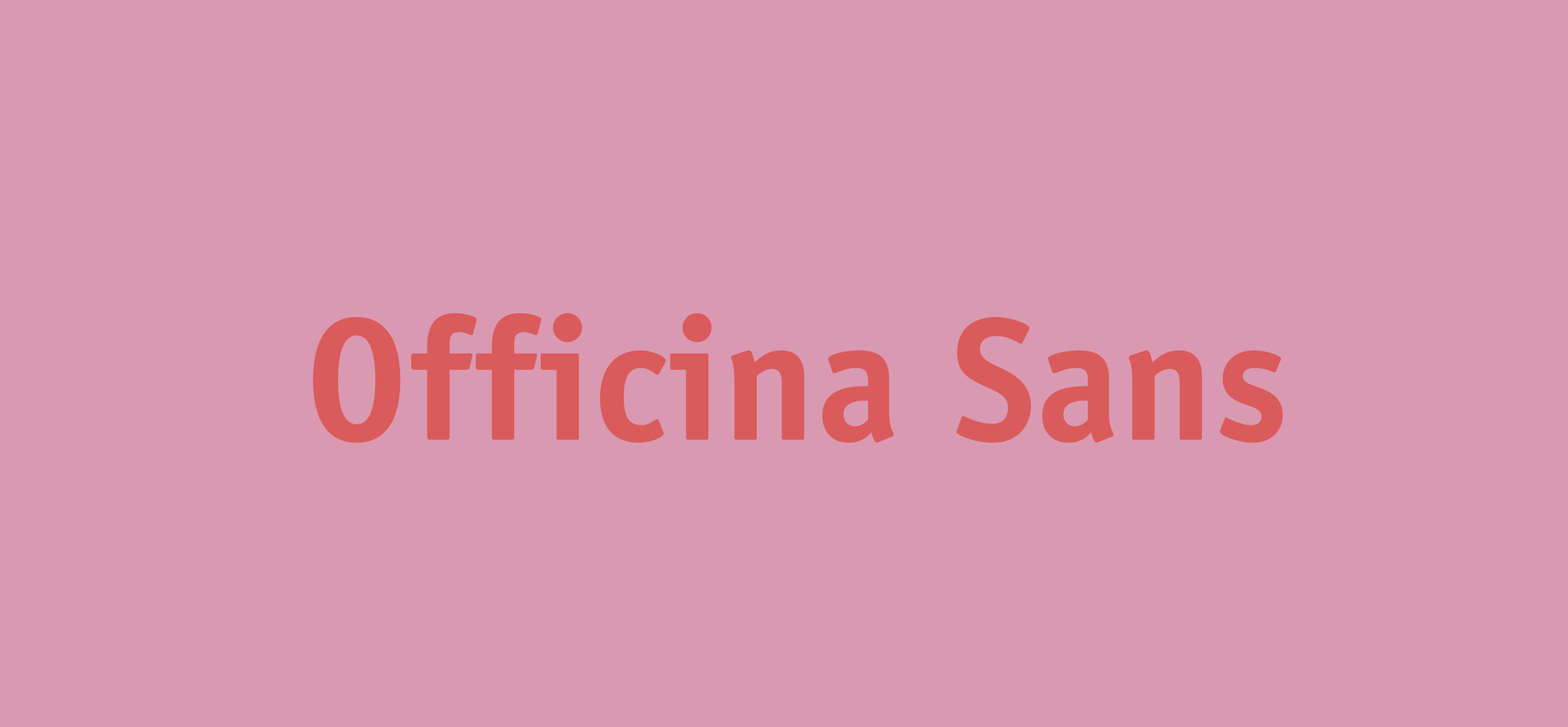
ITC Officina Sans
ITC Officina Sans brings a refined, no-nonsense quality to typography. Its neutral yet distinctive character makes it well-suited for both corporate environments and creative projects. The font’s clarity and subtle stylistic nuances ensure that it maintains an air of sophistication, even in functional contexts.

Sofia Pro
Sofia Pro is a geometric sans serif that combines modern minimalism with a friendly, approachable tone. Its crisp, well-balanced letterforms are perfect for conveying clarity and assurance. Sofia Pro’s versatility and refined aesthetic make it a dependable choice for designs that aim to be both contemporary and timeless.
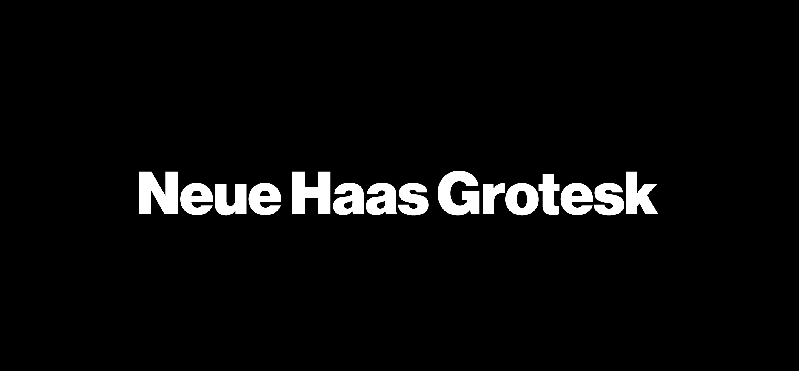
Neue Haas Grotesk
Neue Haas Grotesk revisits the roots of modern typography with a back-to-basics approach that exudes understated charm. Its classic design, updated for today’s digital demands, offers a refined alternative to more ubiquitous typefaces. This font’s meticulous attention to detail ensures a consistent, elegant appearance in any setting.

Tiempos Text
Tiempos Text is a contemporary serif that has won favor among editorial designers for its clarity and balanced sophistication. Its refined structure and graceful strokes make it ideal for long-form text and high-quality publications. Tiempos Text brings a sense of mature, literary elegance to every project it touches.

Graphik
Graphik embodies minimalist elegance with its clean, unassuming design. Ideal for modern branding and digital interfaces, it combines functional clarity with a sophisticated aesthetic. Graphik’s well-proportioned forms and subtle detailing make it a timeless choice for designers looking to create work that is both contemporary and refined.
Whether you’re developing a cutting-edge digital experience or crafting a timeless print campaign, these 10 fonts are sure to elevate your work. Explore these typefaces, experiment with their subtle nuances, and let your designs speak with quiet confidence in 2025.


